
Branding
Role: Creative Director, Designer
Throughout my career, I have had the privilege of providing brand identities and brand packages for clients. Branding and intentionally-designed identities have always been a passion of mine.
Below, you will find a selection of some of my favorite designs.
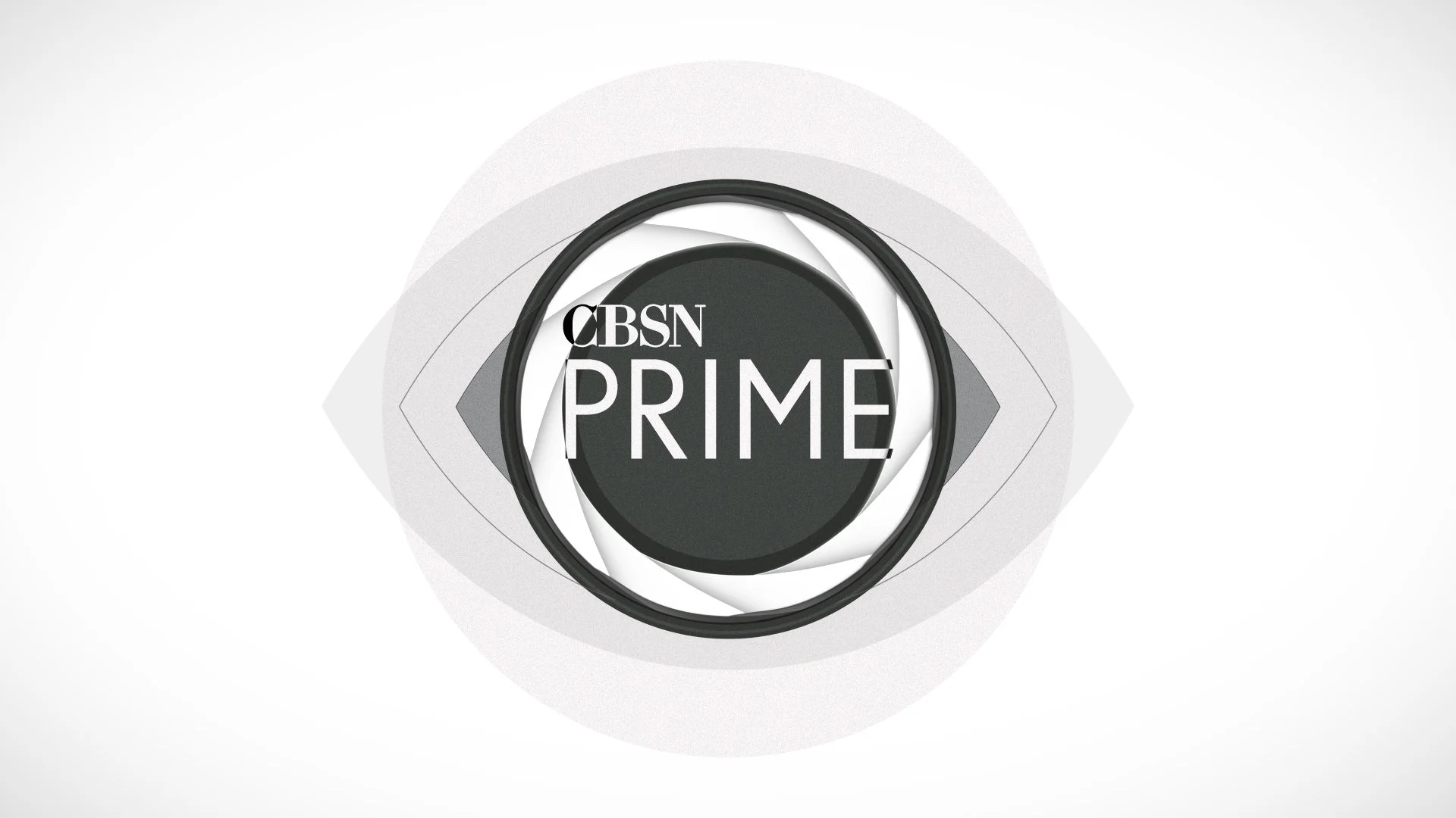
CBSN Prime
Role: Creative Direction, Design, Animation
Client: CBS
To create a stark and impactful identity for a modern news magazine, I took inspiration from one of the world's most iconic logos: the CBS eye.
William Golden's enduring “all-seeing eye” served as a great touchstone for this new CBSN property. My mark evokes a camera's shutter, cleverly plays on the "Prime" title, pays homage to the network's roots, and offers a dynamic transition element for use throughout the broadcast hour.
The wordmark was designed to withstand a wide range of applications, both within a circular frame and as an individual element. Similarly, the motion treatment employs a series of "lenses" through which to feature visual information.


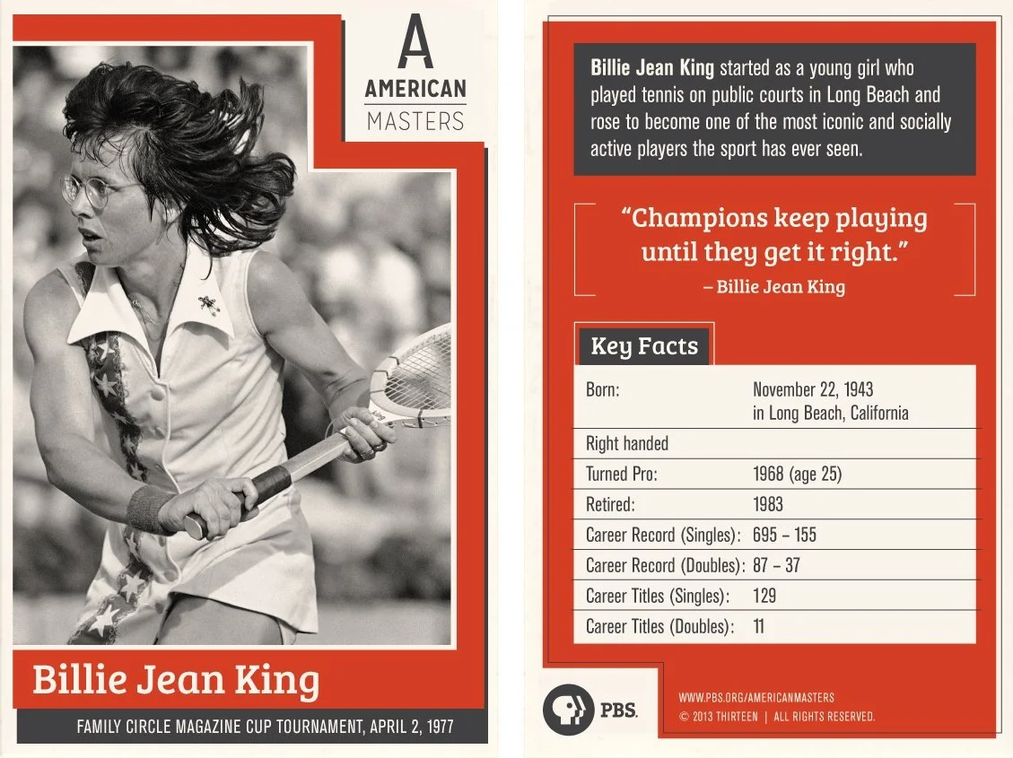
American Masters
Role: Creative Direction, Design
Client: PBS
American Masters is renowned for its biographical documentaries on American television. To align with its future growth and help the brand appeal to a younger audience, I presented the television mainstay with a forward-thinking identity.
The design builds on American Masters' existing brand while emphasizing the power of individual achievement through a single letterform. This mark exudes confidence, trust, and originality in a contemporary yet timeless style.
Inspired by embossed copperplate type, the design removes the bottom half of the A's centerline and implies a key-lit prominence — adding dimension and intrigue.


Fansmit
Role: Creative Direction, Design
Client: Fansmit
Fansmit is a company that promotes choice and community for sports fans and sportscasters. Their platform allows users to choose the voice they want to hear and share their own voice. The design of Fansmit's identity needed to reflect sports and fandom, be inclusive, and stand out among other media brands.
The design features two interlocking F shapes, creating a flag-like configuration. It requests a cognitive jump of the viewer to encourage engagement and retention.
Compared to similar brands in their category, the Fansmit mark is unique and recognizable, but altogether familiar. The color palette has a throwback jersey feel, and the design has a clean and modern look.


Winno
Role: Creative Direction, Design
Client: Winno
Inspired by camera macro iconography, this identity for an image sharing platform was designed to be striking, versatile, and have navigational implications for the app interface.


Crew Cuts
Role: Creative Direction, Design
Client: Crew Cuts
A rebrand for Crew Cuts, a prominent editorial company based in New York City, this design takes inspiration from both classic and modern editing techniques.
The mark evokes a flatbed editor, a set of monitors, an editing timeline, animation keyframes, and two collaborators side-by-side.